March 27, 2020
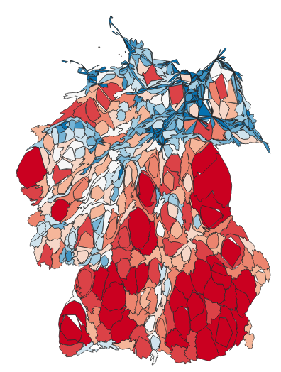
SARS-CoV-2 Cartograms
Update 4.4.2020 Cartogram reprojection using county based shapes and recent data from RKI. These maps are quantile classified – not equal interval classified. This clearly changes somehow the color distribution since the local maxima are not visible anymore. Overall this visualization is graphically very appealing – however it needs more attention for the legend to understand the distribution of values....
